If you want to improve your website navigation, the fastest wins come from four moves: route attention toward the products that convert, design mobile-first instead of shrinking desktop down, order your menu by revenue instead of your org chart, and label it in the words your customers already use.
Do those four well and you cut bounce, shorten the path from landing page to product page, and put your highest-AOV collections in front of more people. Do them poorly and you leave money on the table every day, because nearly every visitor touches your nav before they touch anything else.
That last point is why this matters more than most teams think. In a survey of 6,000 shoppers, 65% said ease of navigation is the single most important factor in a website's user experience. In the same research, 60% of consumers said they abandon purchases over poor UX, and 37% named poor navigation or layout as a reason they'd leave.
So nav clearly moves your revenue. The real question is how much it's costing you right now, and what to fix first. Let's get into it.
How to improve website navigation, starting with this checklist
Before the deep dive, here's the scannable version you can run against your current nav today. Each item points to a specific fix and the metric it should move.
Labels
Write labels in your customers' words, not your internal category names. If buyers think in concerns or use cases ("dry skin," "post-workout"), match that language. Watch nav click-through and category page engagement.
Keep top-level labels short and concrete. "Shop by Concern" beats "Solutions."
Structure and hierarchy
Put your highest-revenue collections first. Left-most desktop items and top mobile items get disproportionate attention.
Cap top-level items so visitors don't hit analysis paralysis. Push policy, affiliate, and partnership pages to the footer.
Keep the most important pages one tap from the homepage. Every extra tap loses shoppers.
Menus (desktop and mobile)
Keep primary nav always visible on desktop. Skip desktop hamburger menus for main shopping pages.
Give mobile its own design, not a squeezed-down desktop menu.
Make sure the menu is easy to reach and tap, with clear contrast against your background.
Breadcrumbs
Add breadcrumbs on collection and product pages so visitors always know where they are and can step back a level without hitting the back button. Track pogo-sticking and back-navigation in session recordings.
Internal linking
Link from content and category pages to your key collection and product pages so visitors (and search engines) can find your best routes to purchase. Watch assisted conversions and pages-per-session.
Mobile behavior
Test icon-style tiles and Instagram-story-style horizontal scrolls for top collections. Measure revenue per visitor, not raw clicks.
Expose product entry points above the fold instead of hiding them behind a tap.
What poor navigation is costing you right now
Your nav bar is one of the first things a visitor sees, so when it's disorganized or cluttered, the friction hits immediately. Subpar site navigation causes a chain of problems:
Visitors leave quickly, sending your bounce rate up and your sales down.
Fewer people come back, so you lose repeat revenue on top of the first sale.
You end up with more one-time buyers than repeat customers, even when you're trying to build subscriptions or loyalty.
People are less likely to recommend you and more likely to share a bad experience. Both cost you money.
Here's how fast that adds up. Dominik Angerer, CEO of Storyblok, whose company ran the research above, put it plainly: "Five purchases per shopper in missed sales may not seem like a lot. But when you scale this up to the number of potential new customers businesses are missing out on, it becomes a very significant amount of money."
Say your typical customer buys from you five times a year at a $100 average order value, so about $500 a year each. Lose even 500 customers a year to poor navigation and that's $250,000 gone. Lose 5,000 and you're looking at $2.5 million you may not even realize is slipping away.
The cherry on top is that poor site navigation also makes it harder for search engines to understand your site, which means worse rankings and less organic traffic.
So you spend more on ads to make up for it. But without fixing the root problem, and with ad costs still climbing, you're just spending more to make less.
We've watched brands struggle, and even shut down, over preventable issues just like this. Yours doesn't have to be one of them.
The navigation changes that move revenue
We're careful about "best practices," since what's best for one brand isn't always best for another. Treat the list below as a starting point for what to test, not gospel.
1. Treat your nav as a conversion element, not a utility
Most brands think about nav like a filing system: "what are our categories, label them, done." That framing is wrong for DTC.
On mobile, the nav bar is often the first thing visitors interact with after the hero loads, especially on homepage traffic from paid social, PR, and direct. Most people scan to orient themselves before they read anything, and the nav is their map.
If your highest-AOV collection is buried two taps deep, that's not an information architecture problem. That's a revenue problem. Nav does more than organize the store: it routes attention toward the products that convert. Once you reframe it as decision architecture, every navigation choice becomes a testable hypothesis rather than a design preference.
2. Mobile-friendly menus are money-makers
Global mobile commerce now accounts for roughly 60% of all ecommerce sales worldwide, with revenue surpassing $2.5 trillion. Over the last decade, mobile commerce revenue has more than quadrupled, driven by mobile-first apps, faster internet speeds, and simplified checkout flows. For many brands, mobile brings in the largest share of online revenue, and the ones still treating it as an add-on are losing conversions and repeat customers.
That means your mobile nav deserves its own treatment, not a shrunken version of desktop. Most teams design the desktop nav first and then squeeze it down for mobile. That's backward, given that 70% to 85% of your traffic is on a phone.
Your menu must be clearly visible on mobile devices (e.g., hamburger menus can sometimes be hard to access).
Navigation should scale to the appropriate size. In other words, text shouldn't be too small or so big that users have to scroll horizontally to read the menu items.
Your menu shouldn't contain so many top-level items, subcategories, or subpages that it's overwhelming for users.
Menus should respond appropriately to interactions unique to mobile devices (e.g., taps rather than clicks on desktop).
Two mobile nav formats we've seen disproportionately outperform:
Icon-style nav: small visual tiles for top collections instead of text-only menu items.
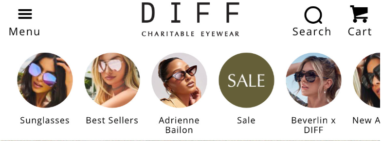
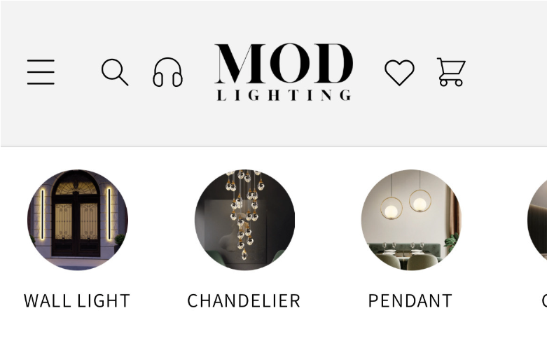
Instagram-story-style horizontal scroll: circular thumbnails with category labels, mimicking a familiar mobile interaction pattern.
Both work because they remove the cognitive load of reading a menu and replace it with pattern recognition. Visual nav also lets you preview product categories in a way text never can.
3. Don't hide your nav bar, and keep it tidy
Whether visitors are on mobile or not, your primary navigation needs to be clearly visible. They shouldn't have to go hunting for it, either because of its location or a lack of color contrast that makes it hard to see against your background. And there shouldn't be so many menu items that visitors feel visually overwhelmed or hit analysis paralysis.
We can't forget hamburger menus here. On mobile, where they belong, they're fine, since you can't fit every menu item on the screen. But on desktop, they create unnecessary clicks and make it harder for visitors to find what they're after. In our experience, they also get fewer clicks, possibly because people read them as the place for less important pages on desktop.
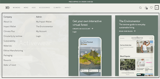
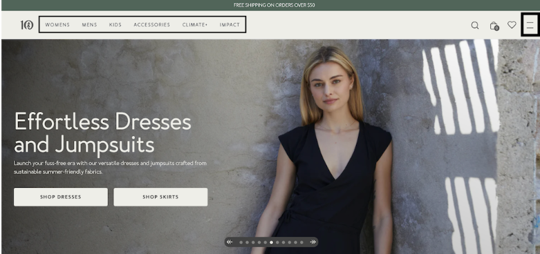
You can occasionally get away with a desktop hamburger on company-specific or account login pages, as Tentree does.
But your main navigation, the pages that matter most, shouldn't be buried inside one.
Here's a pain point we hear on prospect calls constantly: "Our homepage is gorgeous, but it doesn't feel shoppable; people don't realize there's more than three products." This is especially deadly for brands whose traffic comes mostly from PR or media coverage you don't control, so visitors land on the homepage instead of a curated landing page.
The collapsed hamburger nav, plus the big hero video pattern, destroys product discovery. If the visitor has to tap to open the nav, then read through it, then choose a category, then browse, you've stacked three steps between them and a product. Most won't make it.
The fix: expose product entry points directly on the homepage and in a persistent nav. Quick-shop collection tiles above the fold. Visible category links in the header. A "shop all" CTA that doesn't require any taps to surface. Brand immersion is fine, as long as it doesn't come at the cost of product visibility.
4. Reorder by revenue, not by org chart
The default failure mode: nav order reflects how the brand thinks about itself ("here are our four product lines, in the order we launched them"), rather than how customers buy. The fix is to let data drive the order.
Three data sources to triangulate:
GA4 page-path analysis: which collection and product pages sit in your highest-converting purchase paths?
Shopify LTV-weighted purchase frequency by collection: not just first-order revenue, but which categories produce repeat buyers.
Heatmaps: measure revenue per click, not raw clicks. A nav item with fewer clicks but higher AOV downstream beats a popular item that doesn't convert.
The top revenue-driving collections go first. Everything else gets demoted.
5. Give your most important pages the spotlight
Keep your menus dialed in. Your goals are to drive as many conversions as possible and lift average order value, so it's best to keep pages that won't directly contribute out of your main navigation, or at least keep them to a minimum. That means shipping and return policies, partnerships, affiliate programs, and the like. Your footer navigation is often the best home for these.
As for which pages to spotlight, your analytics point the way. Which collection pages bring in the most revenue? What are people clicking on the most? When you trace the journey of people who bought, which pages contributed most to their conversion?
Once you've identified those key pages, ask whether your top performers deserve more visual weight than the rest. Don't be afraid to play with hierarchy. We've built and tested Instagram story-like quick navs for several brands. Here's one we built for DIFF Eyewear, which highlights a range of key pages, including popular collections and best sellers.
And another we tested for MOD Lighting, which nudges site visitors toward the brand's most popular product category pages.
Plenty of other brands have had similar success making top pages stand out.
6. Segment before you decide
Aggregate data lies. If you reorder nav based on "all users," you're averaging behaviors that should be treated separately. At minimum, segment by:
Traffic source: paid vs. organic. Intent and product awareness are completely different.
Device: mobile vs. desktop. Browsing patterns diverge sharply.
Paid mobile traffic often wants the hero product or the offer they clicked on. Organic desktop traffic is often in research mode and wants category exploration. If those two segments need different nav, that's also your strongest case for personalization: swap the nav order dynamically based on source and device. It's one of the highest-ROI personalization plays, because nav is touched by nearly every visitor.
7. For multi-SKU brands, add "shop by" filters in or near the nav
Once you know your revenue paths from the data work above, make those paths explicit in the nav. This is what we call the Best Path to Purchase framework:
Shop by concern (skincare, supplements, wellness)
Shop by format (capsules, gummies, liquid, powder)
Shop by use case (morning routine, post-workout, travel)
Shop by collection or kit
More menu items won't help here. Nav that mirrors how customers decide will, because a skincare buyer doesn't think "I want a serum." They think, "I want to fix my hyperpigmentation." Match that decision frame and your nav converts far better than one organized by product type.
Help visitors orient themselves and find their route
Good navigation does two jobs: it tells visitors where they are, and it gives them an obvious next step toward what they came for. The menu is only part of that. Three often-ignored elements do the rest of the wayfinding work.
Breadcrumbs keep visitors oriented
On collection and product pages, breadcrumbs (Home > Skincare > Serums) show visitors exactly where they've landed and let them step back a level in one click. That matters most for people arriving deep in your site from search or ads, who never passed through your homepage. Without breadcrumbs, their only way "up" is the browser back button, and plenty of them just leave instead. Check your session recordings for pages where visitors bounce back and forth without moving forward. That pogo-sticking is a sign they can't get their bearings.
On-site search is navigation for people who already know what they want
Some visitors won't browse your menu at all. They'll look for a search bar and type the product or benefit they're after. If your search is buried, slow, or returns weak results, you're turning your highest-intent visitors away at the door. Make the search field easy to find, and review your top internal search queries regularly. They're a free, honest list of what people expect you to carry and the exact words they use for it, which feeds straight back into your labels.
Internal linking guides the route between pages
Your nav isn't the only path through the site. Links inside your content, collection pages, and product descriptions route visitors toward related products and toward the pages that convert. Pointing shoppers from a blog post or category page to your best landing page or bestselling collection shortens their path to purchase, and it helps search engines understand which pages matter most. Track pages-per-session and assisted conversions to see whether your internal links are pulling their weight.
3 examples of navigation done right
Granted, we don't have specifics on how users interact with the nav bars below. But across several different types of website navigation, we've spotted strategic elements that are likely to make them effective. Here's what we found.
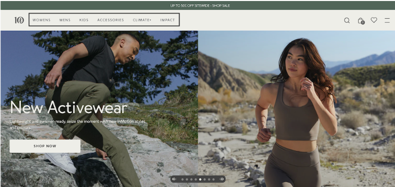
Tentree, a sustainable clothing brand that plants 10 trees for every item purchased, makes navigating its site smooth in more ways than one.
All top-level items in the header menu have clear labels and focus on one of two goals:
Getting website visitors to shop
Highlighting Tentree's impact (to win over consumers who share the brand's values)
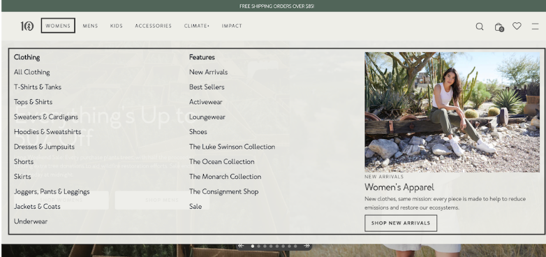
The dropdown menus then narrow options by clothing type and features so visitors can find the right page in one click. On the right, there's also a search bar for quick navigation.
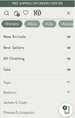
On mobile, this experience consolidates into a single hamburger menu.
Visitors can scroll horizontally through the high-level categories at the top (women's, men's, and so on) and select from the categories underneath.
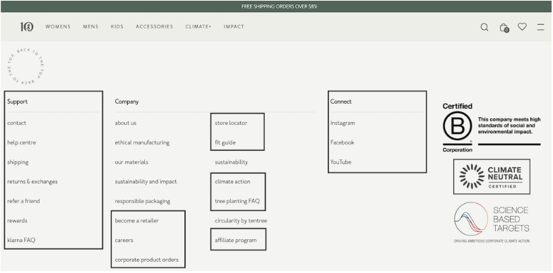
What about the footer menu? It points to pages that aren't in the main menu, secondary pages that matter less than product- and impact-related ones. We're talking support pages and social media links.
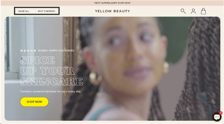
Yellow Beauty is a turmeric-based skincare brand with over 10,000 satisfied customers and counting. The experience on its site has no doubt been a contributing factor. This Shopify store's website navigation is deceptively simple. What did we notice?
For one, the two menu items in the header account for different stages in the buyer's journey. "Shop All" is for people ready to find the right skincare product and open their wallets once they do. "Why Turmeric" is for the ones who need to investigate a little more before filling their carts. Both inch site visitors toward conversion.
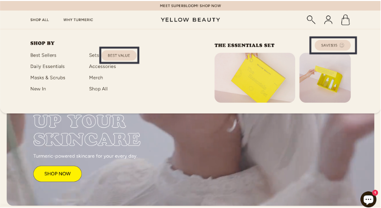
Hovering over "Shop All" reveals the subcategories to choose from, with a few cues that steer attention where Yellow Beauty wants it. Notice the "best value" and "save $35" badges alongside the product images. All three draw attention to the brand's sets. Promoting sets lifts order values above solo products, and the odds of repeat purchases climb too, since customers can fall in love with more than one product on their first order.
Last but not least, the "Shop All" link delivers on its promise by being clickable and matching user expectations. It's a nice convenience for shoppers who'd rather not shop by category in the dropdown.
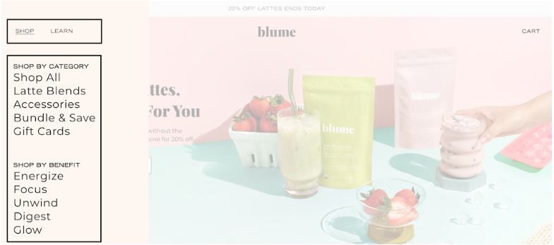
Latte brand Blume uses several menu types, including a header menu that expands into a left sidebar on desktop.
The neat thing about the "Shop Menu" is that shoppers can filter by category or by benefit. And they get a subtle reminder that Blume's lattes aren't just a treat, they have health benefits too.
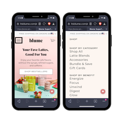
Mobile users get the same navigation options. The only difference is that the filters live inside a hamburger menu.
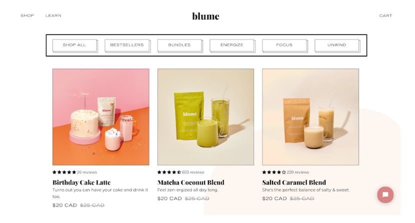
The horizontal menu on the "Shop All" page does the same job, and it's a lot more visible than the desktop and mobile menus we just showed.
Notice how both menus focus on actions that lead to conversions. They point only to product pages and educational pages that endear potential customers to the brand.
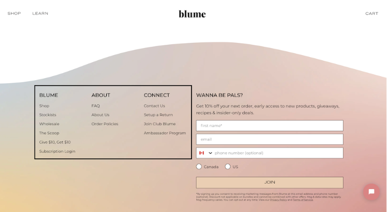
Pages that aren't closely linked to conversions show up in Blume's footer menu instead. That way they're still accessible, but they don't clutter the menus above the fold or distract from a CTA that could drive sales.
These three brands are just a few examples of how to build your website navigation. But how should you make the final call?
How to perfect your website navigation menu
You could just browse similar sites and copy the navigation that seems to work for other brands. But that's never a sure way to improve UX or drive more sales. Often it does more harm than good, because of the differences between your brand and theirs, or their ideal customers and yours. So let us walk you through the conversion rate optimization process we use day in and day out at SplitBase to lower risk and raise conversions. We call it the Testing Trifecta.
The first step is in-depth quantitative research, also known as digging into analytics. For site navigation specifically, we'd review a mix of the following:
Google Analytics (or whatever analytics tool you use) to see which pages get the most clicks, which are the most valuable, and what path users take through the site.
Heatmaps, including clickmaps and eye-tracking heatmaps, to understand which areas draw the most attention and drive interactions.
Information hierarchy, to see whether navigation is organized in a way that keeps key pages and supporting subpages easy to reach.
Next is in-depth qualitative research. That means usability testing, but our team also runs on-site surveys, chat support analysis, and session recording reviews to surface navigation pain points.
You'd be surprised how many CRO agencies skip this step or only do surface-level qualitative research. It's essential, because while analytics can tell you what is or isn't working, it can't tell you the why. You need qualitative data to reach the reason and, from there, the right fix.
Only after we've run both quantitative and qualitative research and pulled every last insight do we move on to testing hypotheses and measuring their impact.
At this point, we might run or recommend an A/B test to find, for example, the best placement for your navigation bar or which design lifts conversion rate. Or we'd use multivariate testing to find the highest-performing combination of navigation elements, exploring different placements, text colors, button colors or shapes, and fonts or font sizes.
From there, we'd apply what we learned to the design. That's not the last step, though. We're firm believers in continuous testing, so, in true SplitBase fashion, we'd keep running usability tests over time to confirm the changes had the effect we wanted. If you tackle this project on your own, you should do the same.
And if you don't have the time or the comfort level with CRO to run the Testing Trifecta yourself, we're here for you. Request a free proposal for more details on how we'd make sure your site navigation helps your bottom line instead of hurting it.
Frequently asked questions about website navigation
How do I know if my website navigation is hurting conversions?
Look at two things first: your bounce rate on high-traffic pages and the drop-off rate between your homepage (or landing pages) and your product or collection pages. If visitors are landing and leaving without clicking deeper, navigation friction is a likely culprit. Heatmap and session recording tools can confirm it by showing where people click, where they hesitate, and where they give up. If the visitors who do reach your product pages convert at a healthy rate but very few make it there, the nav is your bottleneck.
Should I use a hamburger menu on desktop?
In most cases, no. Hamburger menus hide your most important navigation behind a click, and on desktop there's no reason for that, since you have plenty of screen space. We've consistently seen visible, always-exposed navigation get more engagement and drive more clicks to product and collection pages than a collapsed menu. The exception is secondary pages like account settings, support, or company info, where a hamburger can work without hurting conversions.
How often should I test my website navigation?
Nav should be an ongoing experiment surface, not a one-time redesign. Because nearly every visitor interacts with it, even small changes can have an outsized effect on your funnel. We recommend testing nav changes the same way you'd test PDP elements or checkout flows: form a hypothesis based on your quantitative and qualitative research, run a test for at least three to four weeks, and measure the downstream impact on revenue per visitor, not just clicks. Anytime you launch new collections, shift your product mix, or see a meaningful change in your traffic sources, it's worth revisiting your nav structure.
What's more important: the order of nav items or the labels I use?
Both matter, but order tends to carry the bigger revenue impact, because it determines what visitors see and click first. Items on the left of a horizontal nav or at the top of a mobile menu get disproportionately more attention. That said, labels can make or break clarity. If your customers think in terms of "concerns" or "use cases" rather than product-type categories, matching their language in the nav labels can meaningfully lift engagement. The best approach is to test both: reorder first based on revenue data, then run label tests to fine-tune.
My brand only sells one or two products. Does nav even matter?
Barely. If you have a tight product line of one to five SKUs, your homepage should work more like a landing page than a traditional store. The page itself becomes the funnel: hero, value props, social proof, demo, FAQ, CTA. In that scenario, a minimal nav (or even no nav beyond a logo and a cart icon) is usually the better choice. Over-engineering the navigation to feel "like a real ecommerce site" adds friction without adding value. Put the design effort into the page itself.
How do I decide which collections belong in my main nav?
Let data drive it, not your org chart. Look at GA4 page-path analysis to see which collection pages appear in your highest-converting purchase paths. Cross-reference with Shopify data on LTV-weighted purchase frequency by collection to find which categories produce the most valuable repeat buyers. Then layer in heatmap data, but measure revenue per click rather than raw clicks. A nav item that gets fewer taps but leads to higher AOV downstream is more valuable than one that gets the most clicks but doesn't convert. The top revenue-driving collections go first. Everything else gets demoted or moved to a secondary position.





.png)